
THE HUMAN INSIGHT
The name that was approved was Mackencore, derived from the Arabic Macken meaning of High Status, Exalted combined with their shell and core deliverables.
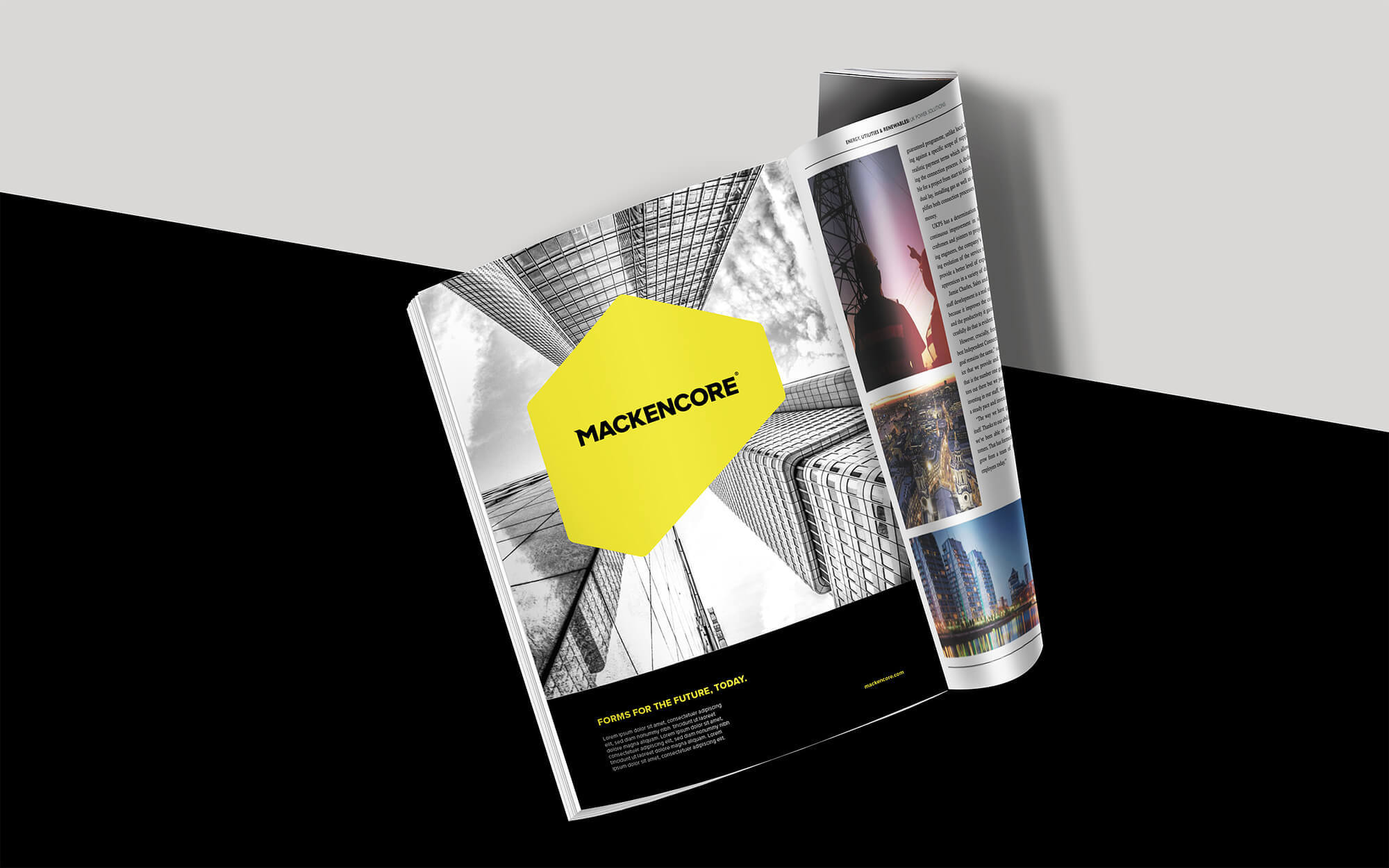
They aimed to go to market with a new technology and a new way to do formwork, they were quite literally shaping new forms and as a result needed to come across as strong and bold. We developed a visual and communications solution around the idea of shifting perspective. This route was inspired by the elements that compose the formwork system. It employs cubes to tell a multi-dimensional story and combined a vibrant colour palette with a monochromatic imagery style which gave the brand a more nuanced tone.
The custom wordmark takes cues from the cubes themselves. Strength and agility are the intended associations with this visual system.


