
THE HUMAN INSIGHT
The chosen brand was all about blossoming, it was a brand that was built
around the idea that throughout the coffee journey the brand could cultivate
value for all parties involved.
The name BLOSS is a subtle nod to the blossoming of value and ethics through
the actions of the brand. Inspired by this thought process, this concept builds
on the idea of “sprouts” that grow into products of value.
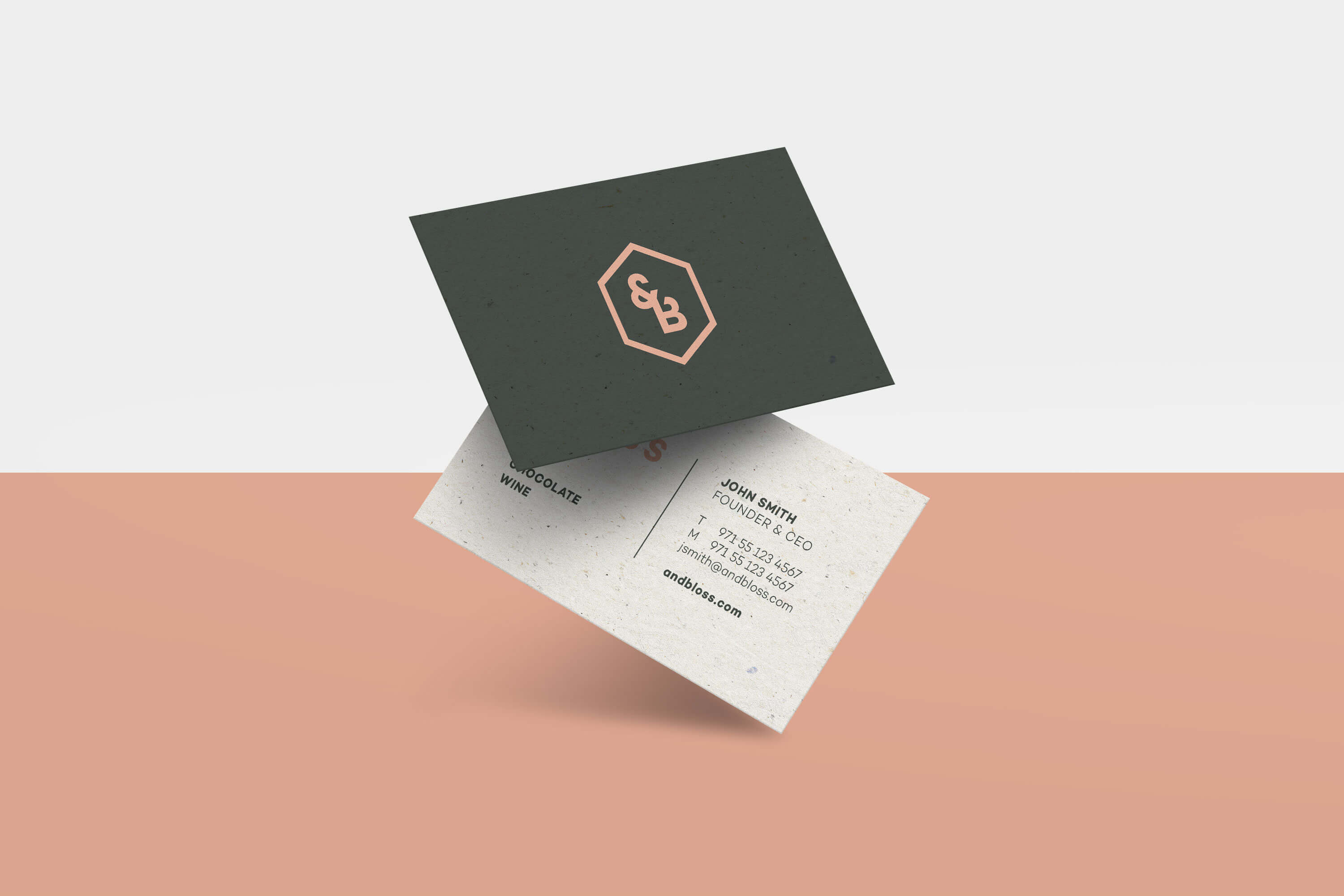
A logo was developed that capitalizes on this idea—a symbol that literally
sprouts to life with the & growing directly out of the word. The visual system is
inspired by the heritage of the brand and uses a colour palette that is bold and
recognizable from a distance.
Building on the educational approach of the brand, design-driven maps are
used as graphic devices to add value to packaging and create an informational
brand system of value.


